Bizfluent is a content-rich website of business- and tax- related articles created for small to large businesses. The brand reached a point where their made-on-the-fly-at-launch logo could no longer sustain their goals.

I redesigned the logo with custom lettering in order to create a unique deliverable for the client. The speech bubble in the previous logo was dropped in favor of simplicity.

All of Bizfluent’s content falls into three main groups. I utilized color coding to distinguish and correspond to the three.
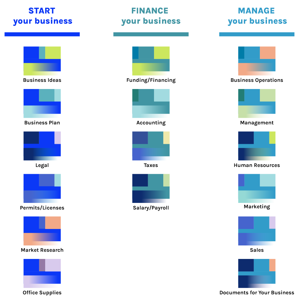

The three color categories are part of a larger, robust system of color usage. This system incorporates the broader category color alongside individual colors at the specific topic level. Basically, each topic has its own palette so everything can be color coded if desired. The topic-level palette comprises one each of light, medium, and dark colors; and one of those is designated as the “pop” color.
This makes color usage a “no-brainer” approach, and can be as simple or complex as needed, so that the color system is as useful to the audience as it is to the product engineers.

A specific use of the dark, medium, light colors was applied in the article page payout. Existing modules like the pulled quote, TL;DR, and related content were updated with color and typography in mind. The client had specific, optimization-related rationale behind the inclusion and position of those modules, so that was a design constraint in this project I was happy to work with.

A palette of colors plus a palette of typography was the solution. I advised and spent time on typography, like the styling of unordered lists, so that as much could be updated as possible without uprooting the existing modules.

I also designed a series of graphical patterns for use as header images. There are two reasons. One: financial content doesn’t lend itself to a lot of unique, great-looking photography. Two: the art director expressed frustration at using safety gradients on every photo for headlines. We wanted a series of abstract images that loosely tied in with the category colors, and tapped into our personal taste for ’90s Mac backgrounds.

The finished set was darker for maximum contrast.
Finally, I designed a set of monoline icons to cover all the article categories.
![]()


