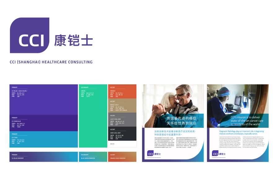
The client: Cancer Care International (Shanghai) is a US-backed organization that aims to provide state-of-the-art care to cancer patients in underserved nations of the world. In particular, CCI (Shanghai) is active in the China market and they recently refreshed their visual identity for this segment.
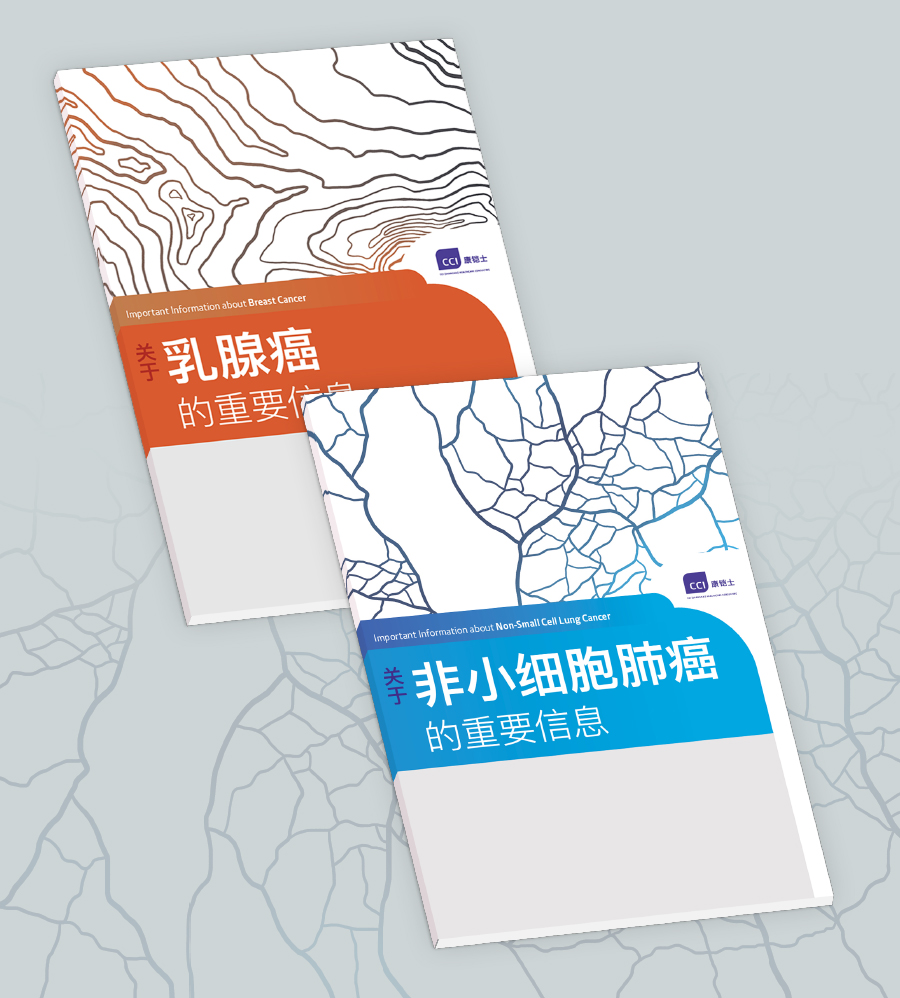
The project: The client was looking to re-design and existing literature on different types of cancer. However, due to the timing constraints stemming from international logistics, the project’s scope changed to forgo the entire publication set in favor of the dust jacket only. The project goal was to unify the existing literature and create a design that is appropriate for the Asian audience.
I was especially excited to work on a project with Chinese typesetting!
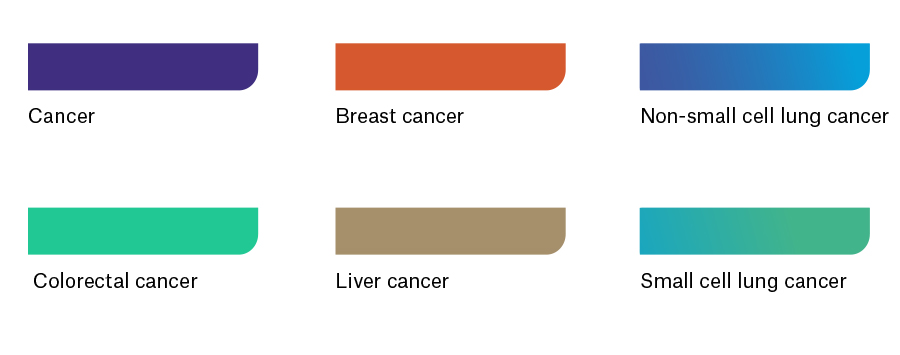
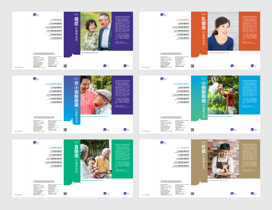
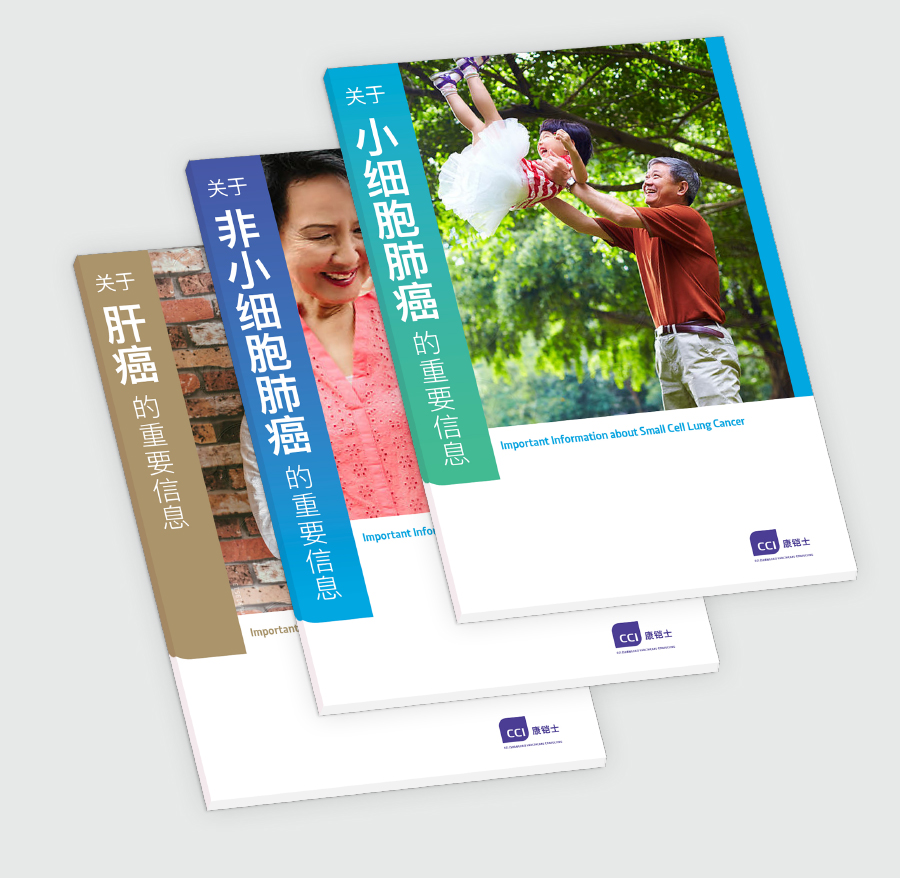
My role: Because the visual ID refresh was so recent, I specifically looked to tie in the brand colors with the content: The most generic out of the six booklets was obviously uses the CCI purple, while the similar topics Small Cell Lung Cancer and Non-small Cell Lung Cancer use two analogous gradients.
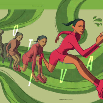
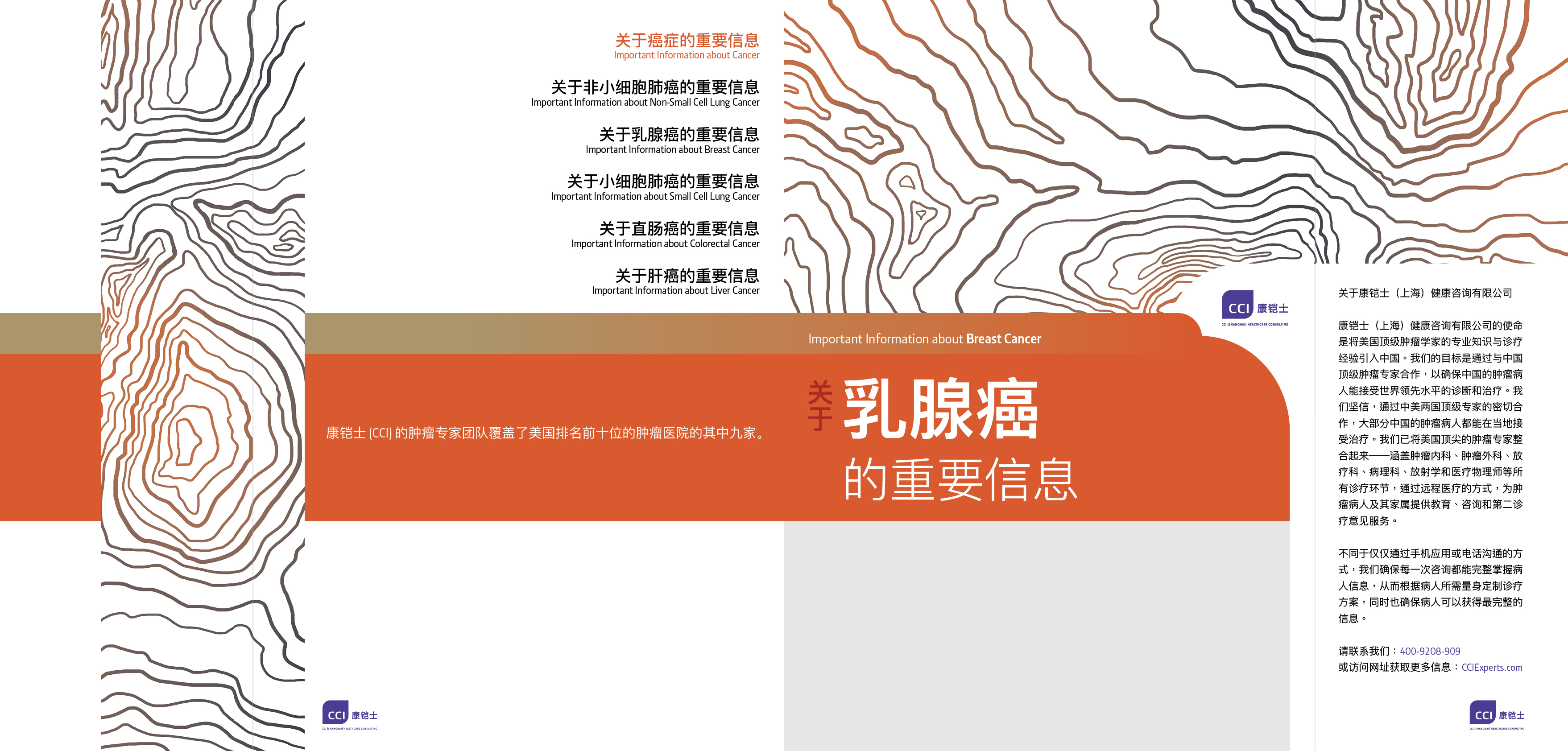
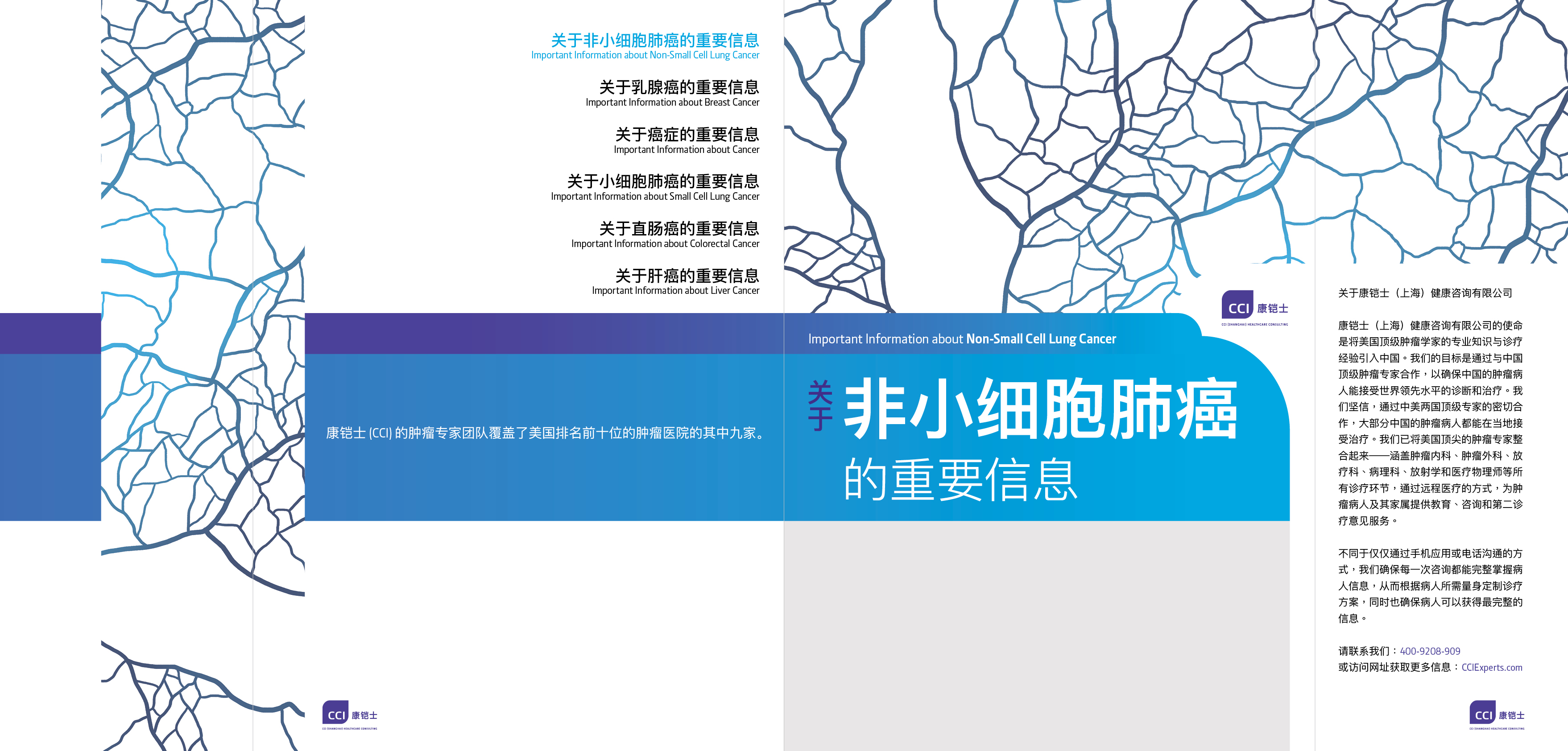
One concept was to use abstracted topographic or plant imagery. Although the the concept is about navigating your body, it is removed from the technical language of scans and histologies to feel more human and warm, an important point.

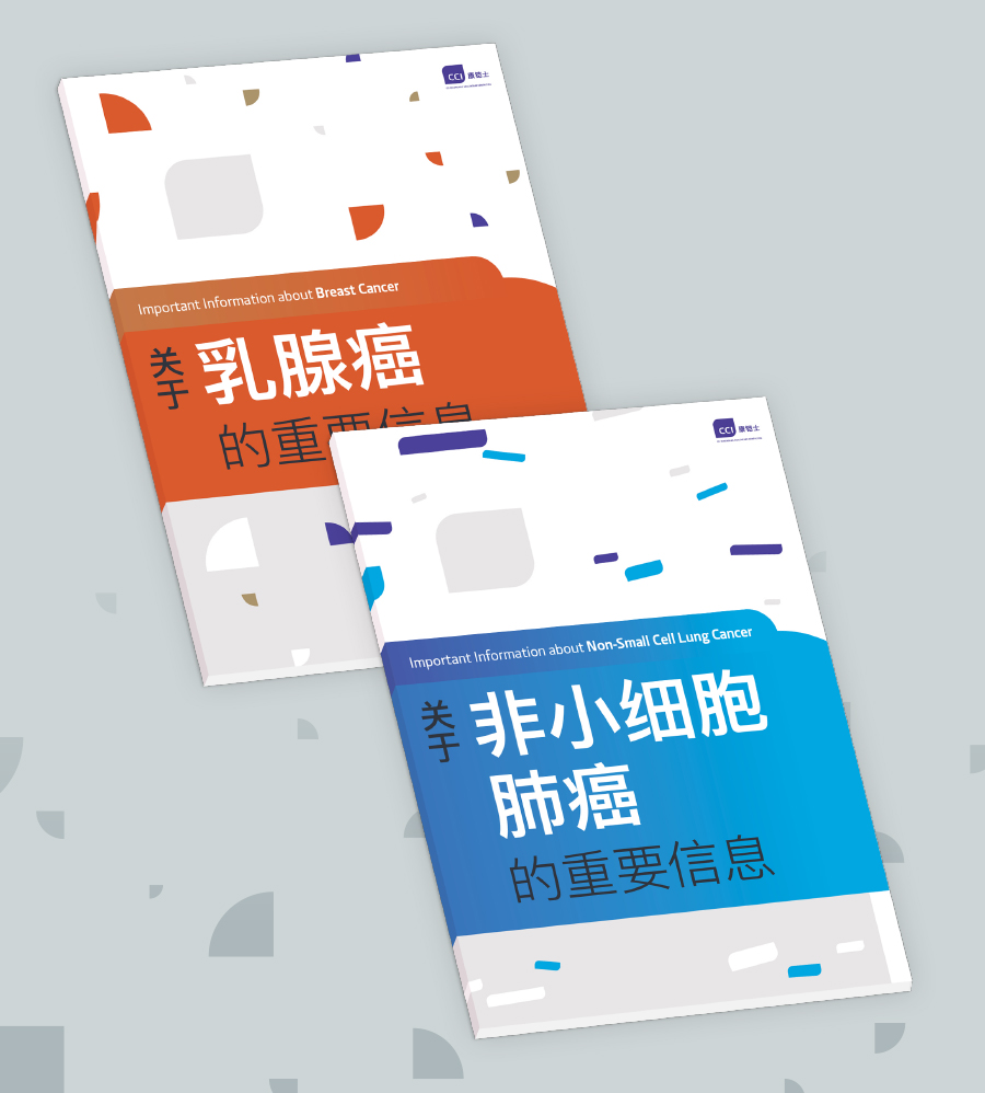
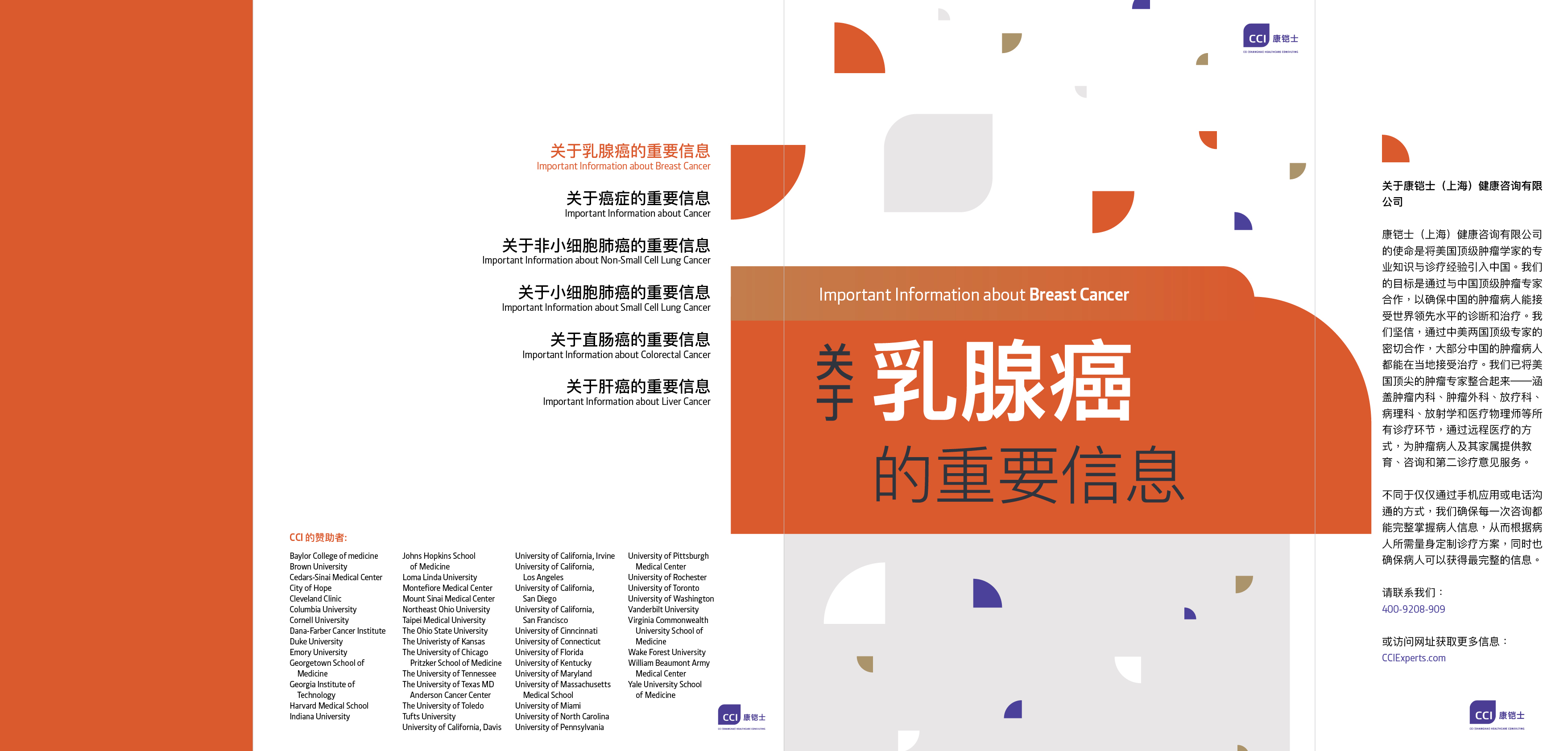
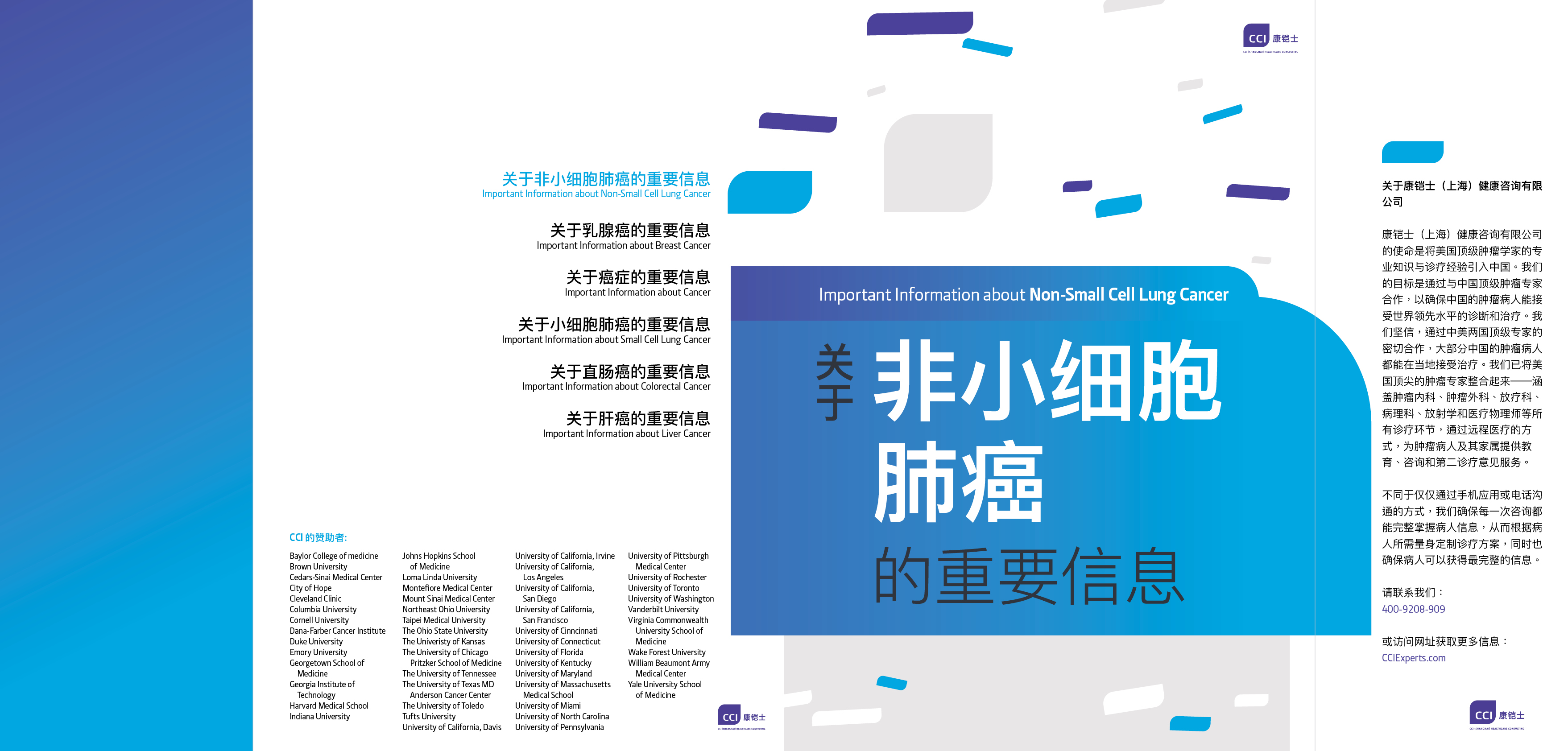
Another concept presented to the client has a theme of graphical permutations. Using the radius-cornered shape from the CCI logo, what are the different ways that it can be divided, rotated, elongated, combined, etc.? It is a graphical representation of the process of cancer, how proteins and cell cycles are disrupted.
The client picked a photographic direction for the final design.
Art direction: Jeanie Chong
Design: Dana Chen

