![]()
Lémore approached me when their initial logo didn’t fit the branding power they needed or the growth of their expanding business. The team was committed to the image of a lotus — it was already in use as a temporary mark, and its connection to meditation and to the co-founder’s Korean heritage made it an ideal symbol.
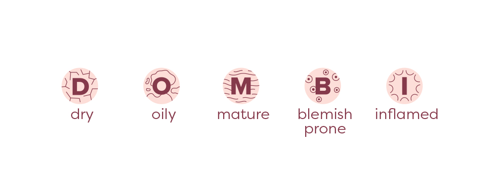
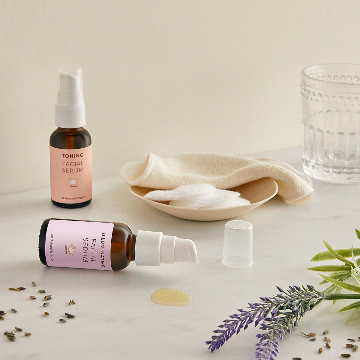
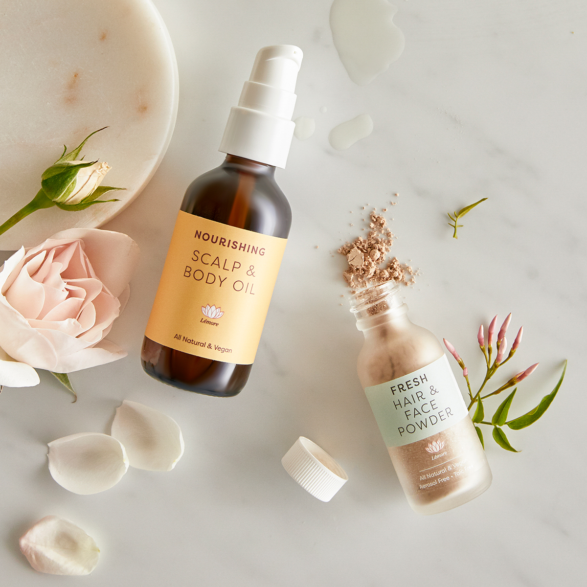
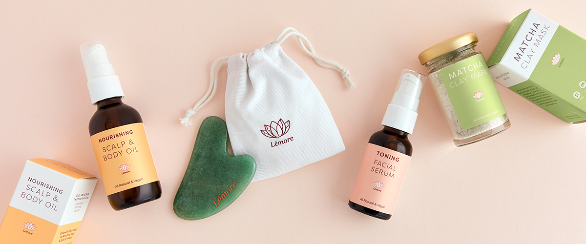
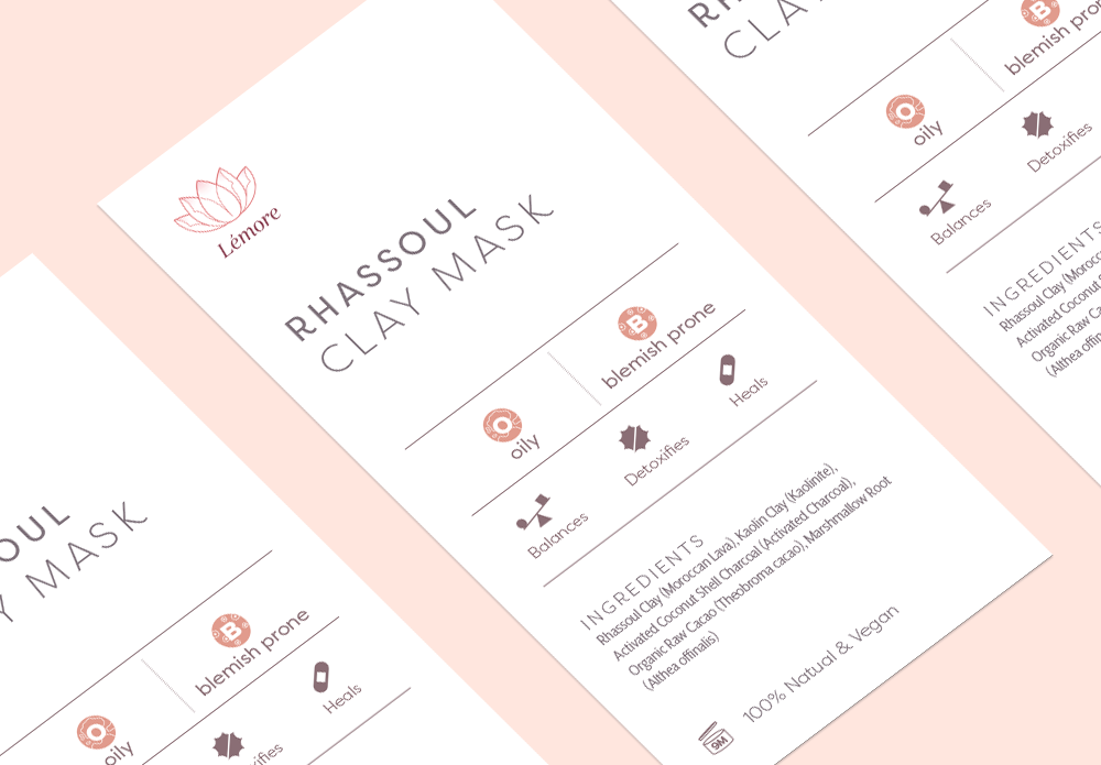
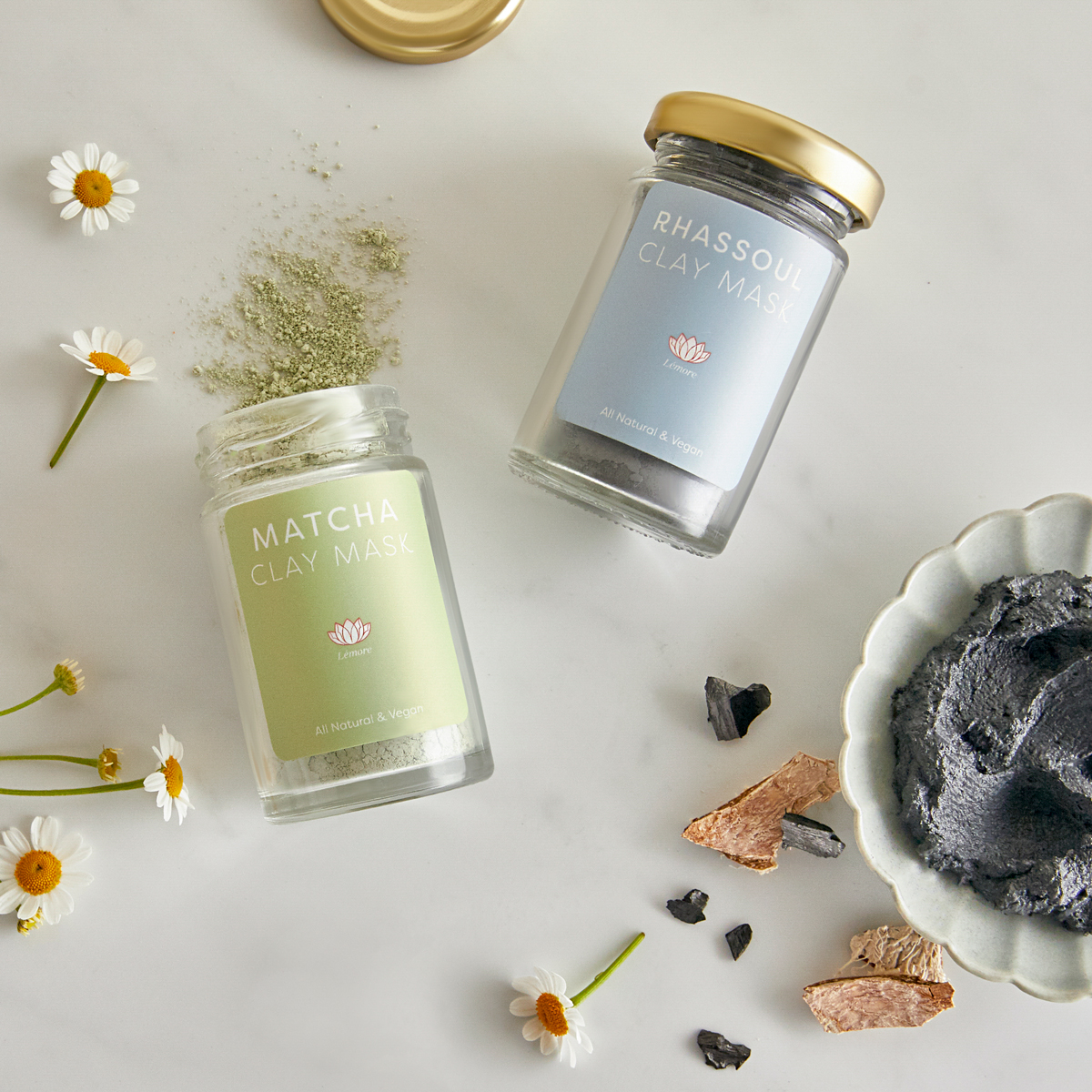
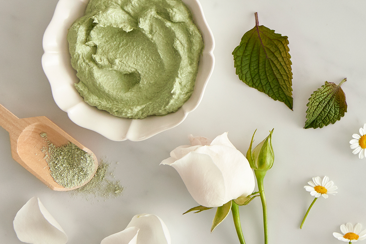
Lémore handcrafts a line of products out of minimalist, quality ingredients that adhere to their vegan, all-natural tenets. Beyond the logo, their identity system is buoyed by an appropriate color palette, typeface, and monoline iconography. Skin type icons help customers easily choose the right product for their skin and purchase related products.
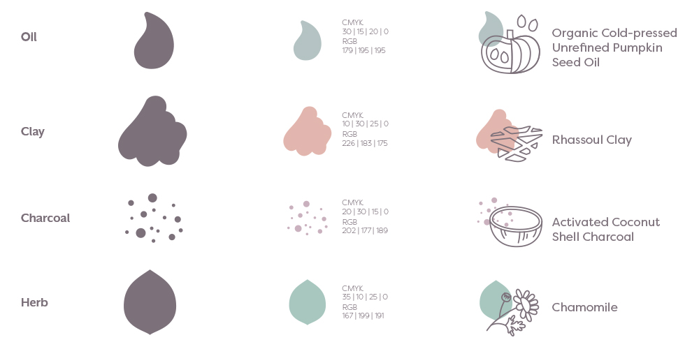
Ingredients for key formulation fall into four categories: Oils, clays, charcoals, and plants/herbs. For each, an identifying color and icon are then combined with a graphic of the actual ingredient.
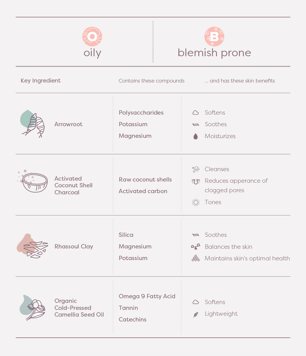
Co-founder Sinyoung has a formulation background and can rattle off the scientific compounds of each natural ingredient as well as their benefits. To communicate this expertise to the customers, a visualization system utilizing several hierarchies of iconography is established.
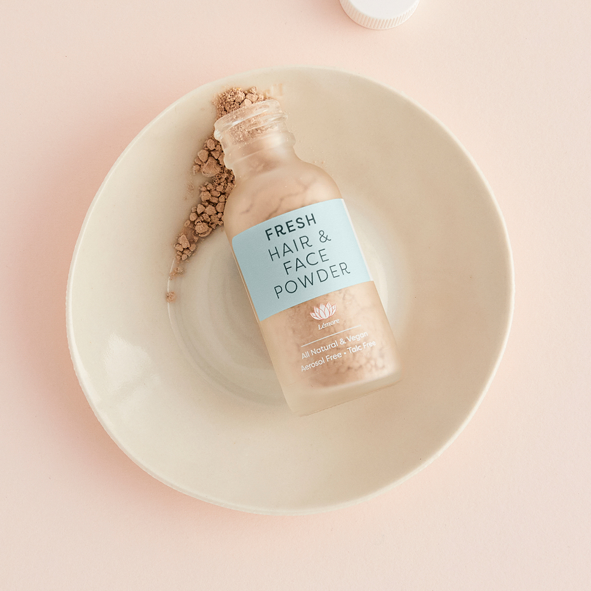
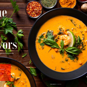
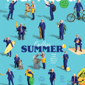
At the height of the pandemic, I worked with amazing photographer Jillian Lenser and superstar stylist Libby Marshall and art-directed a photoshoot 1,900 miles away via Zoom.
Creative direction, art direction, design: Dana Chen
Photography: Jillian Lenser
Styling: Libby Marshall